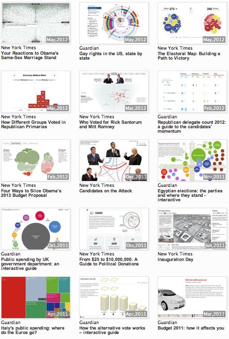
A Vault of Visualizations
 Many will agree that The New York Times and The Guardian are important – maybe the
most important – pioneers when it comes to the use of interactive visualizations in
journalism. Therefore it is interesting to compare these two newspapers. How do they manage the
production of their interactives? And what are the similarities and the differences in their
visualizations? Actually, these are precisely the research questions that Marije
Rooze answered to get here master’s degree.
In her thesis (supervised by Yuri Engelhardt and myself) Marije first describes the characteristics of both papers and how they organize their online activities. To find out whether differences in identity and approach lead to differences in design and production, she then analyses 156 interactive graphics created by either The New York Times or The Guardian. Among the variables that she compares are the topic of the visualization, the kind of data that are used, the level of user participation, and the implemented storytelling techniques.
She concludes that her research has shown less exciting results than expected. The visualizations produced by both news organizations are in many ways comparable. With one exception: The New York Times regularly involves the audience but in a rather restricted setting. It this regard The Gray Lady still fits in the classic gatekeeping model. The Guardian, on the other hand, offers users the opportunity to create their own visualizations and thus redefines its role from the provider of news to a provider of data.
Marije has decided not to publish her thesis online but she did announce to write a series of blog posts that touch on different aspects of her research. I really hope she does, because there are a lot of interesting topics in there. In the mean time she started updating the corpus she used for here research. At the moment the overview shows 248 visualizations, so if you are interested in interactives, bookmark this visualization vault!