The Functional Art: learning with a smile on your face

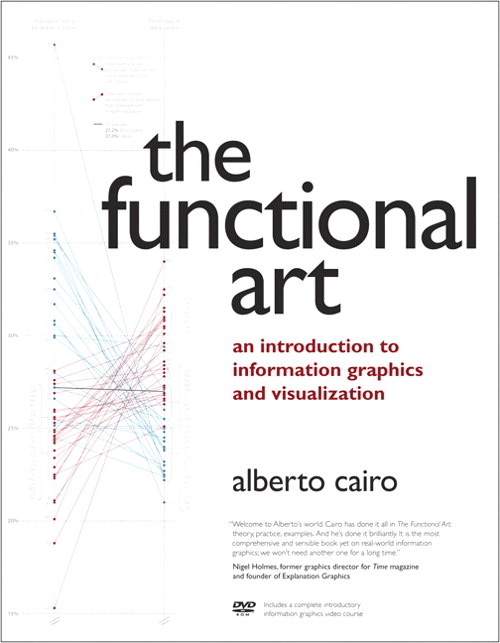
This weekend finally my copy of The Functional Art arrived, Alberto Cairo’s long-awaited introduction to infographics and visualizations. Jubilant reviews can be found around the web (among others by Robert Kosara, Nick Diakopoulos, and Stephen Few) so I’m not going to praise again Cairo’s excellent mix of design practice and perceptual and cognitive theory, the wealth of his examples – mostly his own work- and the very interesting interviews with the avant-garde of data visualization and infographic design. Instead, I will focus on just one chapter, not very surprisingly number 9: The Rise of Interactive Infographics.
In this chapter, Cairo discusses general concepts from interaction design and describes – with a lot of examples – how these can be applied to infographics. So Don Norman’s principles of design (visibility, affordance, feedback, constrain, and consistency) lead to useful rules of thumb like: highlight relevant parts of your graphic, don’t hide pieces that are essential to understand the whole story, make sure the design of objects suggests what you can do with them, and be consistent in your interface design, preferably throughout a series of graphics.
In a similar manner, Ben Shneiderman’s Visual-Information-Seeking Mantra is the point of departure for a paragraph on the structure of interactives. Examples show how different interactive techniques (scroll, zoom, sort, filter, et cetera) can be used to navigate linear and non-linear graphics. At this point, I somehow expected a reference to the appraised work of Segel and Heer on narrative structures of visualizations, but true to the title of the book Cairo prefers a typology of interaction by Rogers, Sharp, and Preece. They categorize styles of interaction that are not based on form or structure, but on functionality. What is the purpose of the infographic: instruction, conversation, manipulation, or exploration?
I would have really loved if Cairo had elaborated a bit more about how interactivity in his view not only can be used to navigate an infographic, but how – from a cognitive perspective – it can help the user to achieve these different goals. What techniques are better for exploration, and what structures are ideal for instruction? However, this book is not only about interactives. For that, we have to wait for this German work which is due next February. And hey, wasn’t somebody trying to write a thesis on this topic?
Back to chapter 9. The final paragraph is about planning an interactive project. You won’t find lists with bullet points taken from some project management guide here, but a step by step personal account of a project Cairo did with The New York Times, including interesting facts about the topic at hand (in this case tennis courts), personal anecdotes and homage to the people he worked with. This style is illustrative for the book as a whole. Cairo writes from a first person perspective about his own experiences in the newsrooms of magazines and newspapers around the world (his print background shows when he consequently writes about ‘readers’ instead of ‘users’). Footnotes and references show he is up-to-date with the literature in several disciplines, but you never get the feeling you are reading a textbook. Apart from the outstanding content it is this conversational style that makes this book a must-read for everyone interested in infographics and visualizations. Reading it is learning with a smile on your face.