Before adding all the interaction you can imagine, think!
 Andrew and Louis are two computer engineers
from Minneapolis who wanted to know where their tax money went. So they collected the data and
put them on WhatWePayFor.com. That are a lot of data. So
now Google and art and technology center Eyebeam have created a dataviz challenge for
designers to visualize how individual federal income
taxes are spent by the US government.
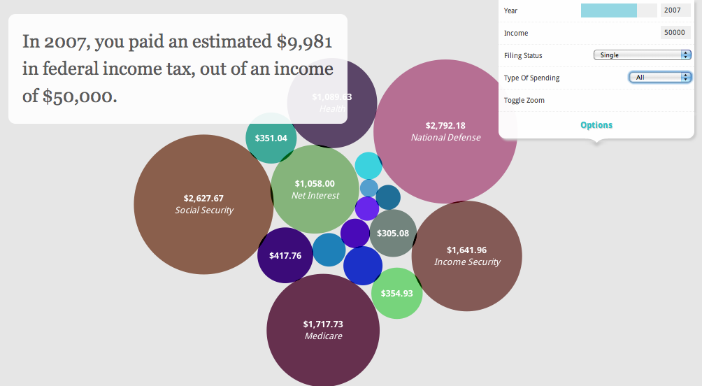
To inspire potential participants the site offers some links to nice visualizations about the destination of tax money, including an interactive bubble chart and ditto timeline, but also an explanimation and the wonderful (but not very intuitive) tool to create a Better World Flux. Last but not least Jono Brandel from Google Creative Lab created an example visualization in HTML5 that allows American citizens to input their income and see how the government spends their dollars.
Who wants to join the competition has to know that the judges will be looking for “that wow factor, that addictive tool that shows us something we didn’t know, something that illustrates relationships, hidden stories, and simple facts in a way that is uniquely insightful to tax payers.” They will pay attention to storytelling, clarity, relevance, utility and aesthetics. There’s some controversy about the rule that the challenge only is open to “users who are physically located in the United States” but for me the most interesting part of the briefing consists of this “Note on Interactivity”:
We’re excited that the web is making it easier than ever to create interactive data visualizations, and we’re hoping that this challenge will produce some great interactive pieces. That’s why we’ve provided the API. However, before you start adding all the interaction you can imagine, think about what meaning an interaction brings to the piece and how best to convey that meaning.
(via Chart Porn)