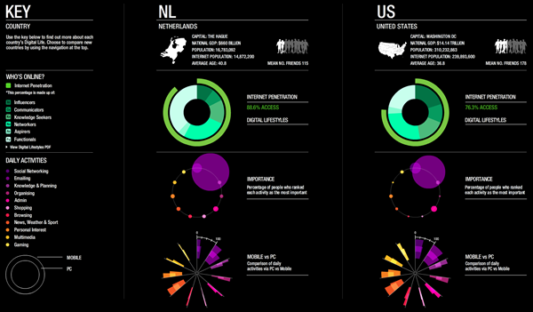
Dashboard of Digital Live
 Before I decided to write a thesis about
interactive infographics I wrote a research proposal
for a study into the digital habits of online news consumers. The working title read: What are
they doing online? The answer to this question is (at least partly) given by TNS. This custom
research agency surveyed almost 50,000 consumers across 46 countries about their online
behaviour and perspectives. The results of this Global Digital Life research
project are beautifully visualized in a interactive dashboard that allows users to compare the
internet penetration and digital lifestyles in different countries and between different
generations. Some of the key finding: Globally, people who have online access have digital
sources as their number one media channel and, on average, they are spending more time on social
networks than on email. To be honest I find the interface more interesting than these results,
so I’m glad I changed my subject.