Datavis in documentary
 Although this blog is about interactive infographics, I’m interested in other
aspects of
information visualization as well. Lately, as the previous post
indicates, I have been studying Isotype as a forerunner of infographic design. Earlier I wrote
about my fascination with animated infographics or explanimations.
Logically, I was very happy with a presentation by Ekaterina Yudin that I
attended last week.
To obtain her master’s degree in New Media at the University of Amsterdam, Ekaterina wrote a thesis on data visualization in documentary films. She analyzed modern work but also included films by the famous British documentary maker Paul Rotha. During her presentation Ekaterina showed some fine examples of the way Rotha used the pictorial language Isotype to explain economic and demographic processes. Unfortunately these early examples of Isotype on screen are not available on the web – unless you have access to BFI Screenonline.
The other movies she studied are more contemporary. Most are modern classics – at least in the visualization community – like An Inconvenient Truth (2006), Food, Inc. (2008), The Crisis of Credit (2009), Joy of Stats (2010), and Inside Job (2010). I.O.U.S.A. was new to me – I somehow managed to miss it when it came out. This documentary uses all kinds of animated charts and diagrams to explain how the exploding national debt of the United States brings us on the brink of a financial meltdown. Mind you: the film was released in 2008 before the financial system actually collapsed.
In all the examples mentioned above visualizations are used to explain something in a classic, linear narrative. However, as an increasing number of interactive documentaries demonstrates, on the web stories no longer have to be linear. In online documentaries, explains Ekaterina, visualizations can have a different purpose than explanation. Mostly they are used as a part of the interface, like a map or a timeline that helps to navigate the story. Examples are Gaza Sderot (2008), This Land (2009), and The Interview Project (2010).
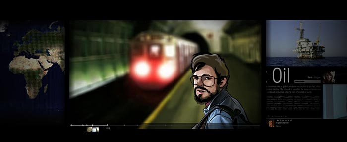
Online documentaries rarely use truly interactive visualizations “where viewers can manipulate the data points on the graphic display or interface, introducing design decisions that do not apply to non-interactive media.” Ekaterina found only one: Collapsus (2010), a dramatic story about the forthcoming transition from fossil fuel to alternative fuels that combines interactivity with animation, fiction and documentary. This award-winning project was produced by Dutch cross media production outfit Submarine. Not coincidentally, the same company hired Ekaterina as the new producer of their online channel. I’m looking forward to future documentaries with lots of interactive infographics!
