Revealing answers instead of data

Last week I wrote about interactive modalities (clicking, hovering, dragging, etc.) and their functions. Probably the most important function of interactivity in infographics is hiding or revealing information, especially in case of multidimensional data.
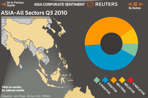
But hiding information can also detach data from meaning as Kaiser Fung clearly demonstrates in Detached in time and space, a blogpost about a donut chart by Reuters on corporate sentiment in Asia. Fung also has some noteworthy suggestions to improve the graphic:
A better way to organize the chart is to start with the types of questions that the reader is likely to want to answer. Clicking on each question (say, compare ratings across industries within a country) would reveal one of the above collections of charts.
In short: try to reveal answers instead of data.