Visualization in the data journalism workflow
 One of the reasons for
the increasing interest in interactive infographics is the fast growing
popularity of data journalism. Although a simple search on Amazon shows that computer
aided reporting has been around since the publication of Philip Meyer’s Precision Journalism in 1969, it is undeniable that data is the new
buzzword in the newsroom.
This renewed enthusiasm is powered by the rapid proliferation of accessible numeric data on the web in combination with a growing number of tools to make sense of them without a degree in computer science or statistics. In the slipstream of the open data movement journalists around the world try to tell stories based upon numbers. If you’re new to the concept, read this explanation on the Guradian’s datablog, or watch Geoff McGhee’s outstanding interactive documentary.
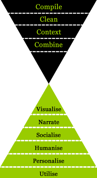
Although I wouldn’t dare to call myself an expert in the field, I try to stimulate my students to experiment with data driven journalism. To get them on track, I offer them a simple workflow inspired by Paul Bradshaw’s Inverted Pyramid of Data Journalism:
-
Start with a relevant question
(Why not pick one from the classic list of who, what, when, where, why, how, or how much?) -
Find and clean the data you need to answer this question
(If they’re not available anywhere, maybe you can create them yourself?) -
Analyse the data. Look for:
outliers (the best, the worst, the highest, the lowest),
differences (then/now, here/there, we/them), and
patterns (that weekly spike, the clustering in that region, the relation between those two variables) -
Explain your findings
(Data almost never answer the question why, so grab your phone and try to find some reasons) -
Tell your story
(What is the best genre to report your findings? How are you going to present your data?)
So what’s missing? Indeed, contrary to the inverted pyramid, there’s no separate step that says: visualize your data. That’s because in my opinion there are two different types of visualization involved in the process. Firstly, in stage three, you use all kinds of visual tools to analyze your data. These visualizations don’t have to be very sophisticated or well designed, as long as they help you to find your answers. Secondly, in stage five, you create a visualization that helps you to tell the story. That one has a different function and its visual and functional design should meet much higher standards.
In my classes, I simply refer to these different visualizations as type 1 and type 2. But after reading Tom Steinberg’s post from last week I think about renaming them to Answer Visualizations and Story Visualizations. Maybe these concepts can prevent starting data journalists from just presenting their own visual tools to the audience. Because in my humble opinion, that’s what a lot of them do. And that’s a pity, because on their own, without proper context, these ‘answer visualizations’ don’t tell any story at all.