Whats the purpose of interactive features?
My research is about the effectiveness of interactives. One thing I’m interested in is the influence of the type and number of interactive features on the ability of an infographic to transfer information. But before you can study this influence, you first have to define what these ‘interactive features’ actually are. Different typologies are possible. For instance, one could look at the form of interactive elements, like buttons and sliders, but in my model of interactivity these are just images or representational modalities. I’m more interested in the functions of these elements, or what I’ve called their ‘manipulation modalities’, like browsing, showing, hiding, dragging, zooming, filtering, or adding data.
Of course, researchers have categorized the functions of interactive features before. Probably the most famous classification is the one Ben Shneiderman proposed in The Eyes Have It, his famous article about the Visual Information Seeking Mantra: overview, zoom, filter, details-on-demand, relate, history, and extract. Recently I found a taxonomy of interaction techniques by Yi, Kang, Stasko, and Jacko. Although their typology looks like the ones above, it’s actually of a higher level. The following categories of interaction aren’t based upon tasks or functions, but upon the intent of the user: with what purpose does he or she perform a certain interactive operation?
- Select: mark something as interesting
- Explore: show me something else
- Reconfigure: show me a different arrangement
- Encode: show me a different representation
- Abstract/Elaborate: show me more or less detail
- Filter: show me something conditionally
- Connect: show me related items
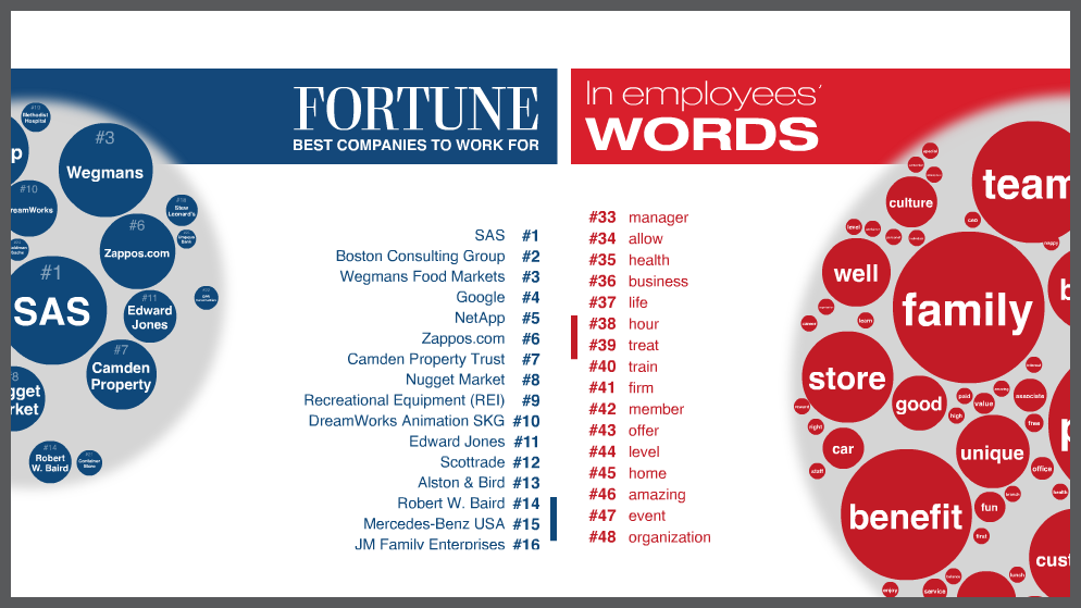
The typology is based on a review of professional information visualizations articles and tools and clearly focuses on the visualization of data. It would be interesting to test its usefulness with regard to interactive infographics in general, for example by analyzing a corpus of popular interactives on the web. According to the authors the categories are not exhaustive: “Some techniques are difficult to classify and do not quite fit into any one of the categories.” A quick try on What employees say, an interactive about the Fortune’s annual ranking of the best companies to work for created for CNN by Infographics.com, indicates that the opposite is true as well: in some cases one single click will perform several of the functions from the list above. Whether that says more about the typology or about the interactive, I’m not yet sure.
