Explanation first, then overview, zoom, and the rest of it
In reply to my previous post about the functions of interactivity Eugene Tjoa advocates more attention to explanation in interactive infographics. I totally agree with him. Information visualization has a very fruitful influence on the design of infographics but most infovis techniques are developed for specialists, not for a general audience. Furthermore, there are no general accepted conventions (yet) about the interaction design of visualizations. And although recent research suggests that visual difficulties can stimulate engagement and active processing of information, I think it’s a good idea to at least initially give users of interactives some clues about what they are looking at and how they can play with it.
At the New York Times they call these clues the ‘annotation layer’ and they take them very seriously. At last year’s edition of the Eyeo Festival, Amanda Cox of The Times graphics department stated that “the annotation layer is the most important thing we do.” Without it, she explained, it’s like saying to your audience: “Here’s an interface, now go ahead and browse for the rest of your life.” If you missed her presentation, be sure to watch the video.
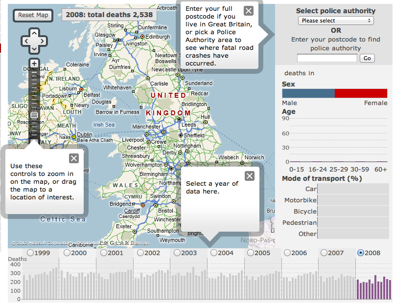
The BBC also often adds a layer of annotation to its interactives. Literally. A good example is their interactive map of deathly accidents on British roads between 1999 and 2008. On opening the page, the actual map is partly hidden behind an overlay with a text that explains what data is visualized and how it can be manipulated. After this ‘window’ is closed, smaller overlays indicate the three ‘manipulation modalities’: you can enter your postcode, zoom in on the map or specify a year.
But when it comes to explanation, even the BBC can’t compete with The LRA Crisis Tracker. The smooth design of this interactive map and timeline in a way conflicts with its sinister content. The website offers a live overview of the atrocities committed by the Lord’s Resistance Army in central Africa. Visitors can track the number of abductions, mutilations and killings in real time.
Maybe it’s because of the gravity of the data that so much attention is paid to clarifying them. On your first visit you are automatically presented an overlay with a movie that explains what the site and the data are about. After closing the video player or on subsequent visits, the map and the timeline present themselves with a small animation that highlights the different interactive options and gives you a feeling for the amount of data. It’s like the designers adapted the famous visualization mantra to: Explanation first, then overview, zoom, filter, and details-on-demand. Unfortunately the animation doesn’t run as smoothly anymore as it probably did when the site was launched. Sad but true, the likely cause is the increase of woeful incidents.
