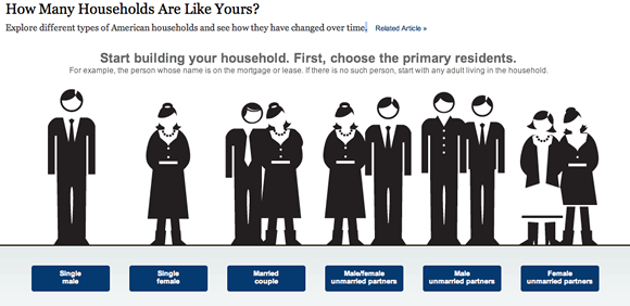
Your own personal infographic
There are all kinds of reasons for adding interactivity to an infographic. After I asked Dutch designers what they considered to be the best interactives on the web, I questioned them about their ideas about the function of interactivity. An incomplete list of recurring keywords would look like this:
- to make a graphic more comprehensible or attractive,
- to keep it up to date or to add layers,
- to show relationships or change,
- to tell a story or to collect data, and, last but not least,
- to involve users by means of localization or personalization.
In other words: to involve users with general data (demographics, for example) you could allow them to tweak the infographic to their own personal situation. And that is exactly what The New York Times did in this very clear interactive showing census data about U.S. households.
