Best Interactive Infographics on the Web (according to Dutch Designers)
What are the most inspiring interactive infographics on the web? It was just one of the questions I asked Dutch infographic designers in a survey I conducted earlier this year. A total of 39 respondents together submitted 90 best practices, either entire websites or specific interactive infographics. Some of them are well known examples, others are nice surprises. These are the websites that contain one or more outstanding interactives according to at least two respondents.
The New York Times (17 mentions)
 Not
surprisingly the Grey Lady of journalism is the most often named as a source of inspiration
when it comes to interactive infographics. Particularly the one about jobless rates for
different groups (5 submissions) was praised: “phenomenal visualization”, “tells a good story, relevant for
many people” and “brings you the information you want on a silver platter”. One designer
commented: “Amanda Cox is really a super talent, along with the team at NYT she makes incredibly
good graphics”. Some other interactives that were specifically mentioned are Is It Better to Buy or Rent?
(“A complicated financial decision made very transparent”), Fractions of a
Second: An Olympic Musical (“Very smart, in this case sound works better than image and elegant design”) and Tracking US Airways
Flight 1549 (“Content and form perfectly match”). The election and census projects were
submitted as well.
Nola.com (5 mentions)
 The Times is what the French call hors
concours. Interestingly enough the number two
on the list is a specific interactive infographic featuring on a local newssite for New Orleans.
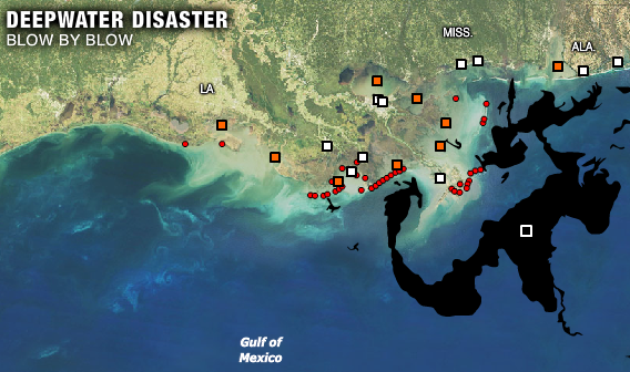
Designers acclaimed the 2010 Oil Spill
Gulf of Mexico interactive for its clear presentation of events: “Beautiful day-to-day overview of the
disaster”. According to one respondent interactivity adds to the usability of this infographic:
“You can determine how and in what pace to read the graphic.”
Gapminder (4 mentions)
 The next one is more in line with expectations. Hans Rosling’s homage to
visual statistics was
nominated 4 times. According to Dutch infographic designers, Gapminder.org
“brings statistics to life”. It’s “the best site for visualizing data”, “simple, but so much
insight”. One respondent revealed: “You’ll never get enough of Gapminder. It gives you a
completely different view of the world.”
CBS (4 mentions)
CBS stands for Centraal Bureau voor Statistiek, a semi-governmental institution responsible for collecting and processing public data about the Netherlands. Since a couple of years the bureau is experimenting with interactive visualization techniques resulting in a showcase both diverse in topics and types of visualization. According to one designer the CBS interactives are good examples of “functional design”.
BBC (3 mentions)
 The good old Beeb defends the honor of the Brits. Specifically mentioned
were the interactive
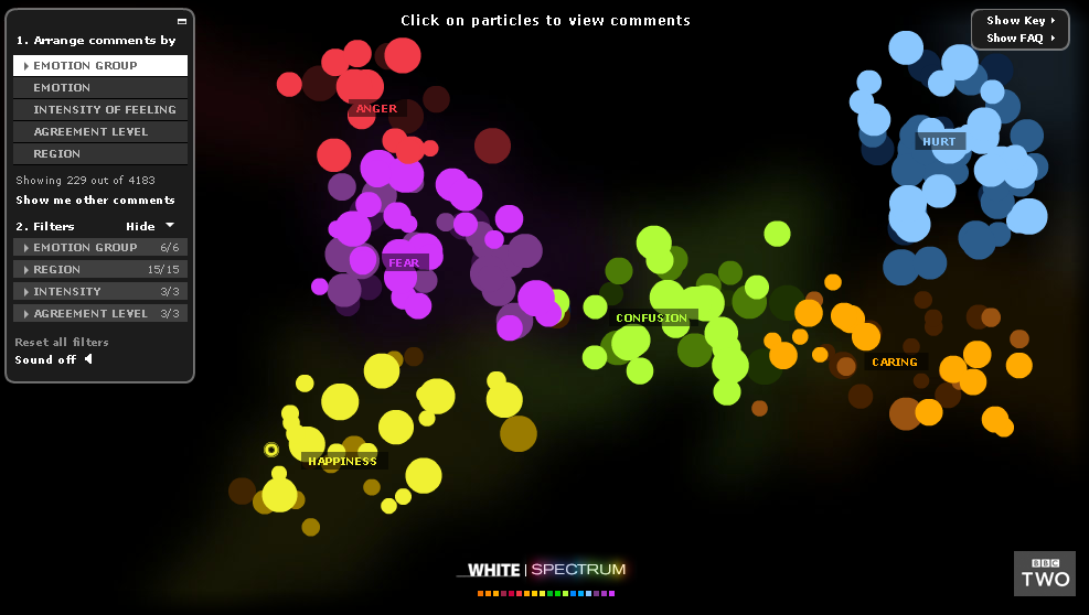
visualization of a debate about the white working class (that
looks a bit like Jonathan Harris’ We feel fine,
that was submitted as well), the Interactive Body
and a piece on the rescue of the Chile miners in
2010. Interestingly enough not one respondent mentioned The Guardian. Given its leading
position in data journalism, I had expected this newspaper to be the number two on the list,
right behind The NY Times. As proven by this very useful
overview, they are definitely in the same league.
Graphic News (2 mentions)
Graphic News is a news agency dedicated to infographics, including interactives. The respondents who submitted this service both mentioned the sport graphics, maybe because they sometimes include live results that are updated automatically.
Google Maps and Google Body Browser (2 mentions each)
One could argue whether Google Maps is an infographic but according to two respondents the service at least is a good example for those who design interactives. The Body Browser was praised as “a nice way to display several layers”.
Prinsjesdag 2010 (2 mentions)
 On
Prinsjesdag the Dutch Queen addresses both houses of parliament and delivers the Troonrede
(the speech from the throne similar to the State of the Union in the United States). The speech
contains the political agenda of the government for the coming year. After that, the
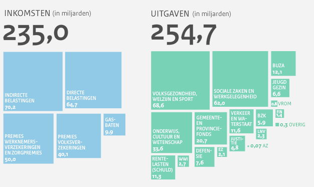
corresponding budget proposal is presented. Last year, the Dutch government used an interactive
Checkbook of The Netherlands to explain the budget. Who knows, maybe that’s where some journalist picked
up the idea ☺
Newsweek (2 mentions)
This interactive infographic of The Worlds Best Countries has featured on this blog before. It compares the world’s top 100 nations on topics like health, education and economy. As one respondent wrote: “A strong visualization based on an immense set of data.”
Information is Beautiful (2 mentions)
Another classic that was well appraised by the visualization community. This interactive balloon race compares the scientific evidence for over 100 nutritional supplements, from Fish Oil to Omega 3. It was recently updated.
Nikon (2 mentions)
 As is clear from the entries above, the use of
well designed interactive infographics is
certainly not limited to newssites. Some of the best examples can be found on websites created
by governments, NGOs or companies. This is also the case with the last two interactives that are
submitted by more than one designer. Nikon did a nice job with Universcale, an ‘infinite yardstick’ that lets
you compare objects from the neutron to a galaxy. “Well
designed, although very complex”, one respondent remarks. “Narrative and explanatory”, the other
adds. For similar interactives about the scale of our universe see this post about The Powers of Zoom.
FedEx (2 mentions)
 Just like Nikon, FedEx uses data visualization
to showcase its intellectual
resources. Paying
tribute to its commercial tagline – FedEx Delivers to a Changing World – the company offers a
series of interactive cartograms that shows how exactly our world is changing on all kind of demographic topics.
“Smooth
movement, gives you the feeling you’re in control”, one designer writes. And that probably is
exactly what FedEx aims at, because: who doesn’t want to be in control of our changing world?
Miss anything? Feel free to leave your own favorites in the comments.